THIS & THAT
MISCELLANEOUS DESIGNS FROM AROUND THE BLOCK
THEMATIC ENHANCEMENT
SWEENEY’S WALNUT ST. TAVERN:
THEMATIC COCKTAIL MENUS
Sweeney's is a part dive bar, part industry hang, part cocktail mad lab tucked into an 1800s-era house on Walnut St. in Franklinton, Columbus, OH. Known for its tongue-in-cheek sensibility and musically-driven soul, the bar is a well-loved watering hole for the arts community it calls home.
Below are the first two installments of thematically-driven cocktail menus, conceived and developed to enhance the retro-meets-craft positioning of the bar.
Acknowledgments:
Cocktail Recipe Development: Sean Gleeson
Theme Collaboration: Sean Gleeson & Justin Ryan
WINTER ‘25
COCKTAIL CATALOG
-
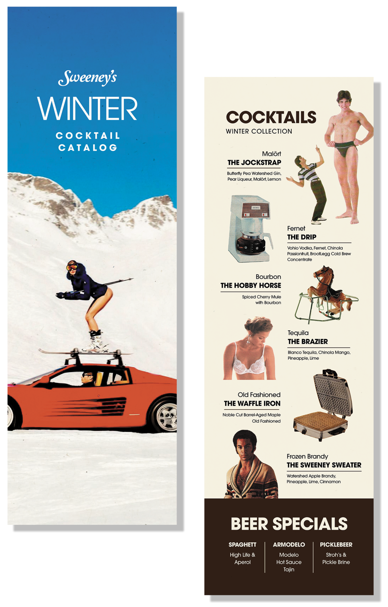
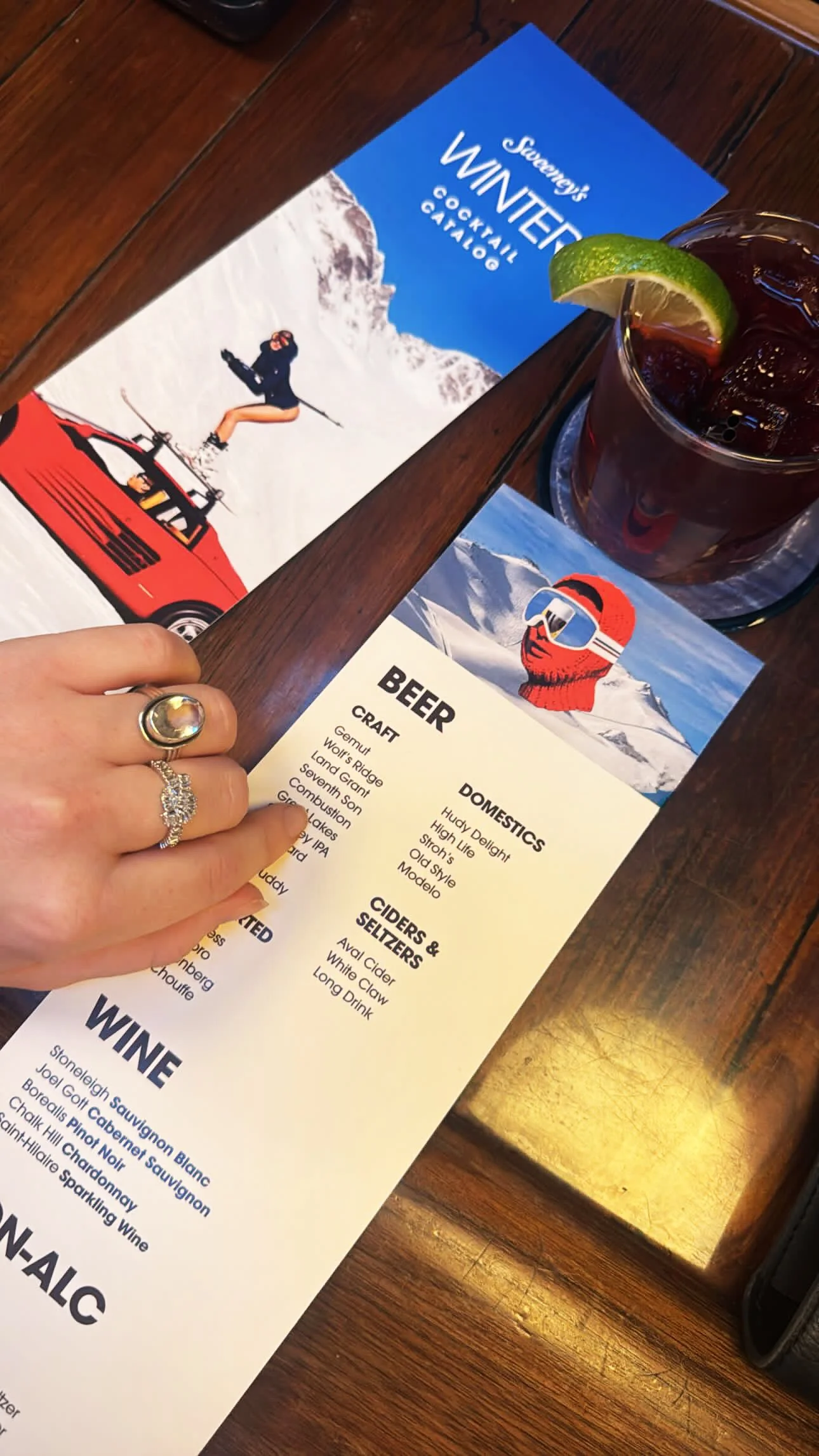
Create an 80s Sears catalog-inspired menu for the '25/'26 holiday season.
-
The menu needed to last through the following spring, so imagery present couldn’t reference any specific holiday celebration, i.e., Christmas lights, etc.
-
The cocktail catalog is rooted in the era the bar lives and breathes most: the '70s and '80s. Imagery, color, and type draw on catalog items and key art that echo that period both visually and tonally, while a ski resort visual direction carried the winter theme without tipping into holiday territory, keeping the menu in play well into '26 as the next round of cocktail selections took shape.

SPRING ‘26
WALNUT HIGH YEARBOOK
-
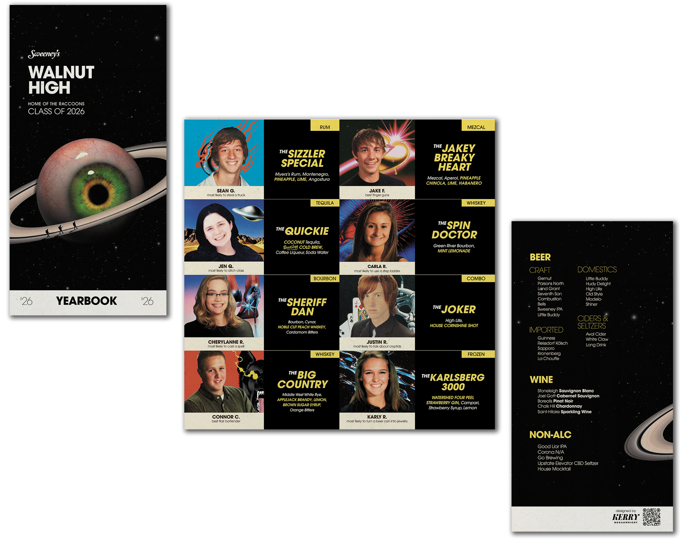
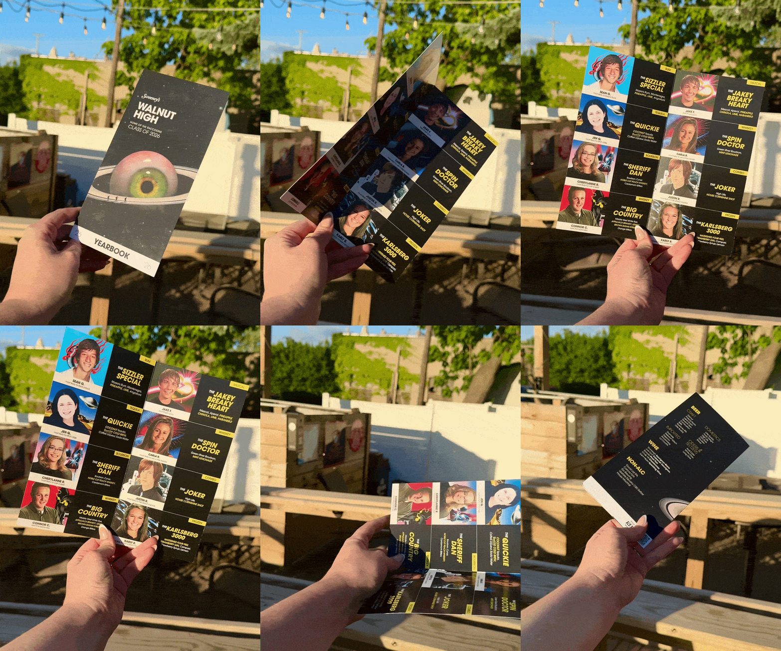
Create a folded yearbook-themed cocktail menu featuring senior photos and custom cocktail recipes from each bartender.
-
Senior photos needed to replace the usual cocktail imagery, so alternative visual elements were necessary to help viewers navigate the menu.
-
Taking inspiration from surrealist cover art from bands like Pink Floyd and Queen, the menu leveraged music-inspired imagery to deepen the viewer's connection to the bar's ethos of depth of experience and individual personality.
Rather than leading with key art of the raccoon, the brand mascot, music-inspired imagery deepened the connection to the space beyond its furry figurehead.
Several type and layout applications, including color/weight variations and ample negative space, allow the viewer to navigate the menu without cocktail imagery indicators. Alcohol flags sit at the top of each section for easy scanning.
DESIGN FOR GOOD:
GIFT CO-CONSPIRATOR
A SWEET SURPRISE
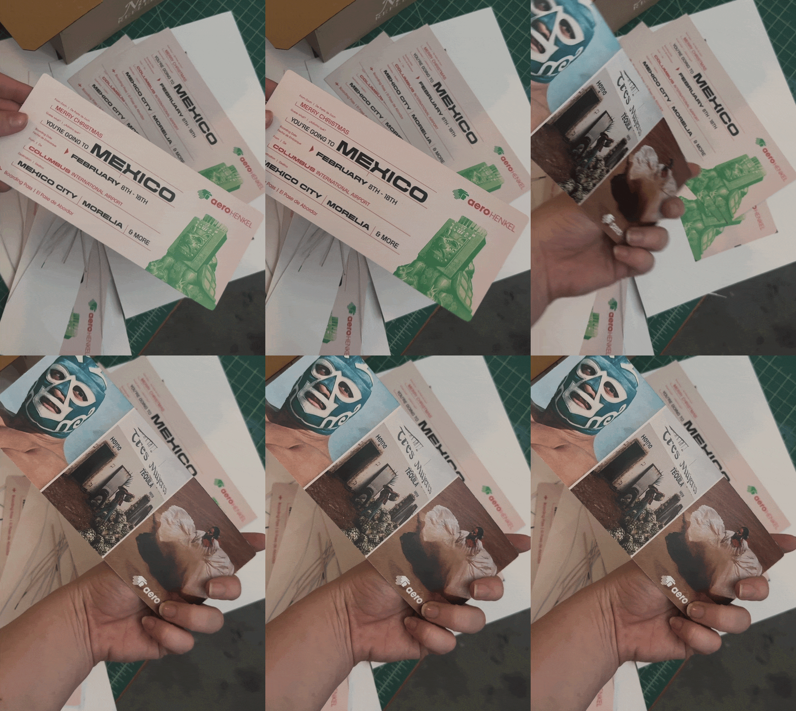
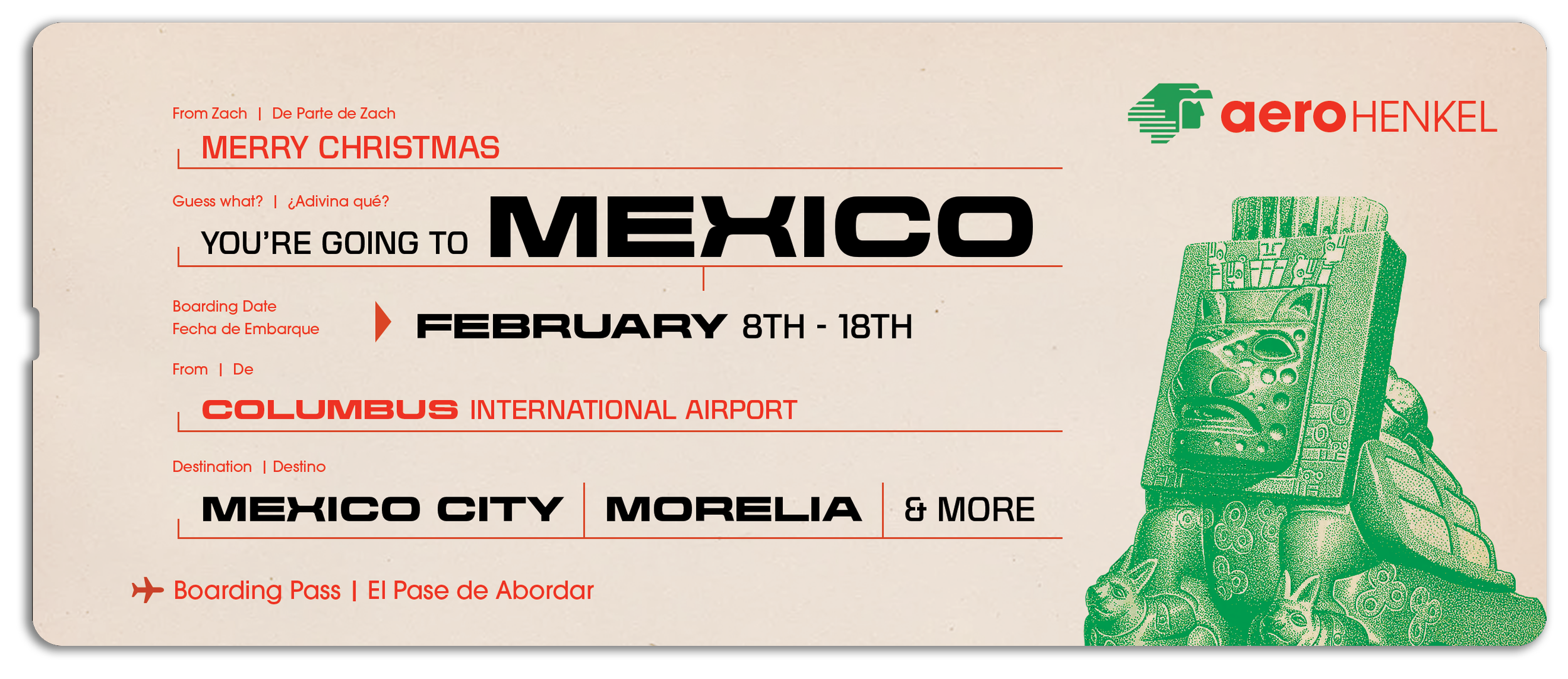
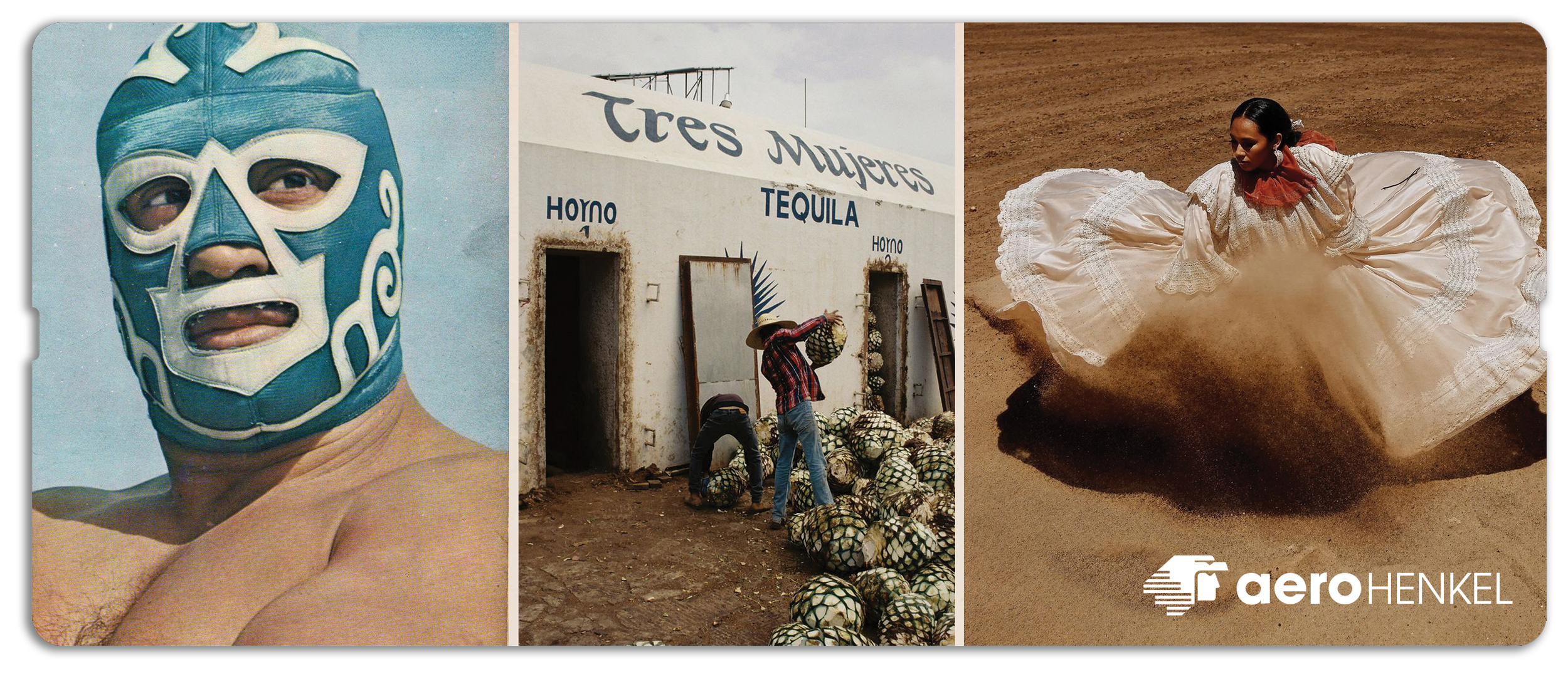
A client came to me in December '25 with a genuinely lovely idea. In an age where digital confirmations have replaced the physical ticket, the romance of gifting one to a loved one hasn't entirely faded. I had the privilege of bringing that sentiment to life as a surprise faux travel ticket, a Christmas gift for a trip to Mexico.

YOU’RE GOING
TO MEXICO
-
Design a vintage-inspired plane ticket to Mexico for a holiday gift, incorporating language into the design of the asset.
-
To increase the visual impact and effect of the design, a mix of typographic treatments guided the viewer to take in the destination and announcement copy first.
A refined, three-color palette more closely resembles a classic ticket.
Small touches like copy details throughout and playful integration of the client's last name into the Aeromexico logo made the piece feel even more personal, while imagery on the back worked to further excitement for the trip to come.